Moodle LMS Redesign
From cluttered legacy LMS into a modern web app that students want to use.
This 8-week sprint redesigned Moodle around DigiPen students' daily learning workflows. The result was a clearer, more integrated student experience that consolidated third-party workarounds into one focused learning environment, with a supporting professor workflow for grading and course management.
11 min read
Impact
A student-first Moodle redesign that made daily learning workflows faster and easier to trust.
Three rounds of iterative testing with DigiPen users resulted in zero negative findings in the final round — and a student experience that consolidated notes, chat, files, modules, and assignment submission into a single focused platform.
- Assignment submission cut from five clicks to two with a sticky upload panel.
- Notes, Chat, and Files replaced three third-party apps students were using daily.
- A supporting professor flow improved grading, announcements, and content upload.
A quick summary

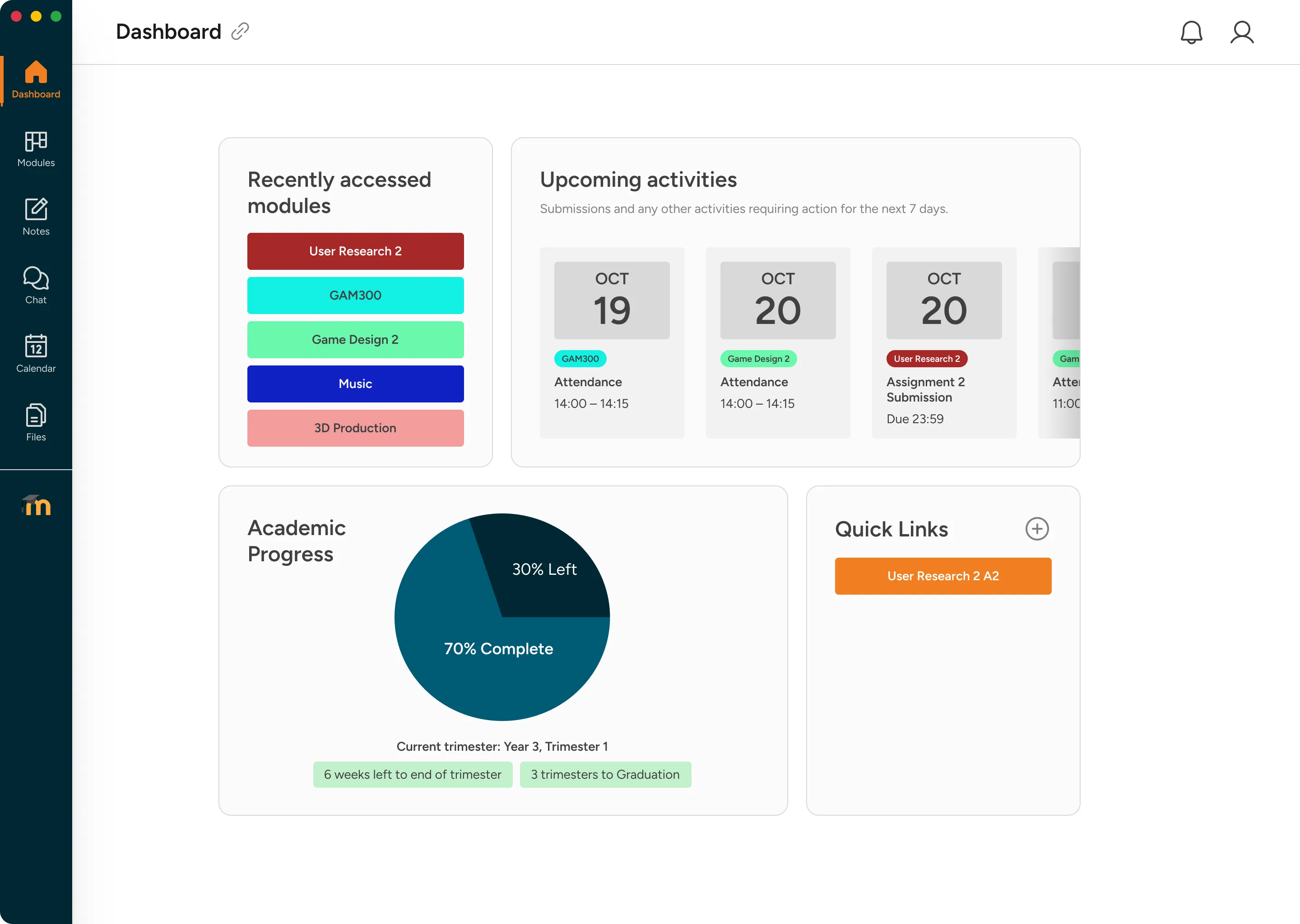
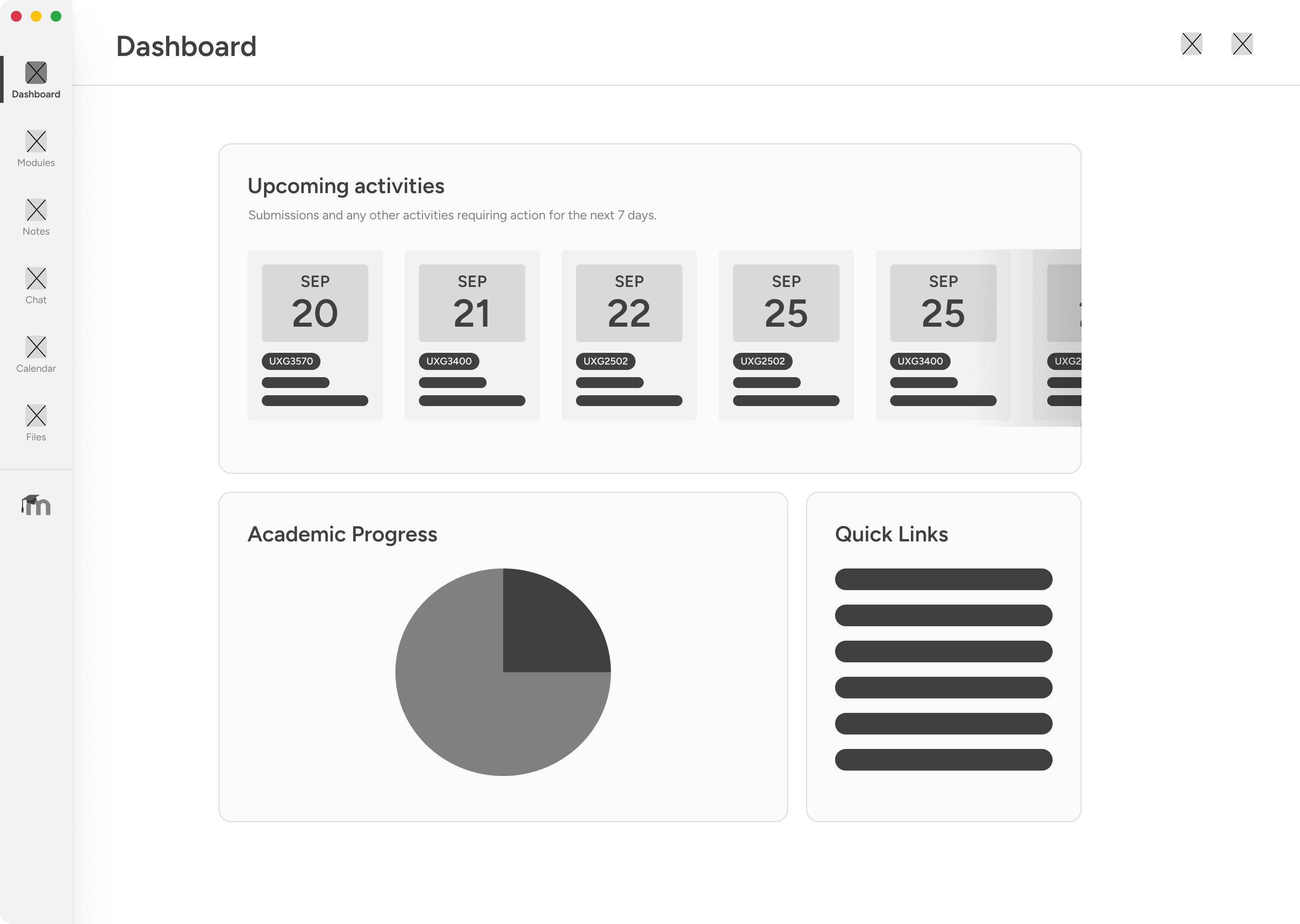
A dashboard that surfaces what matters
Upcoming deadlines, academic progress, and quick links replace a wall of overlapping sections — all above the fold.

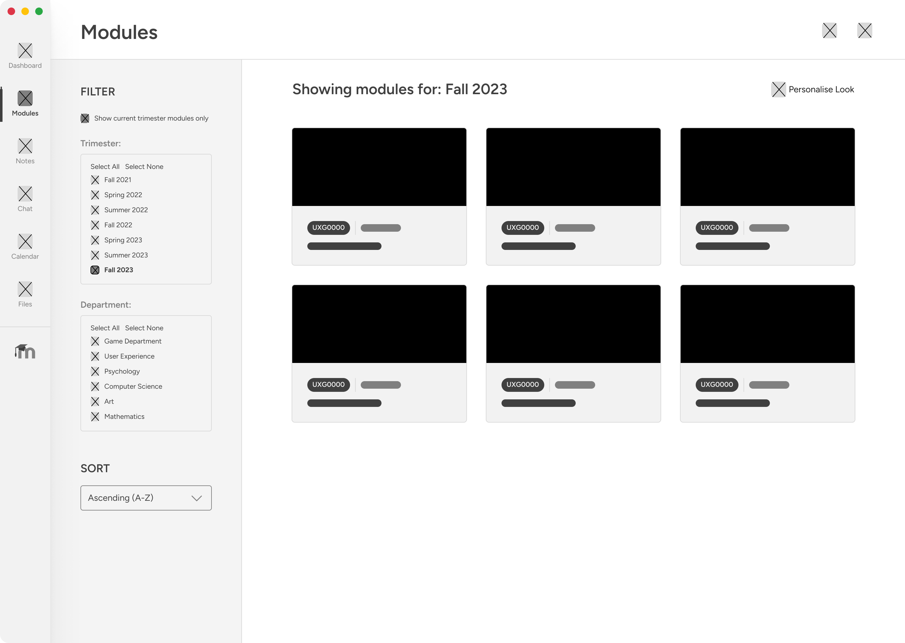
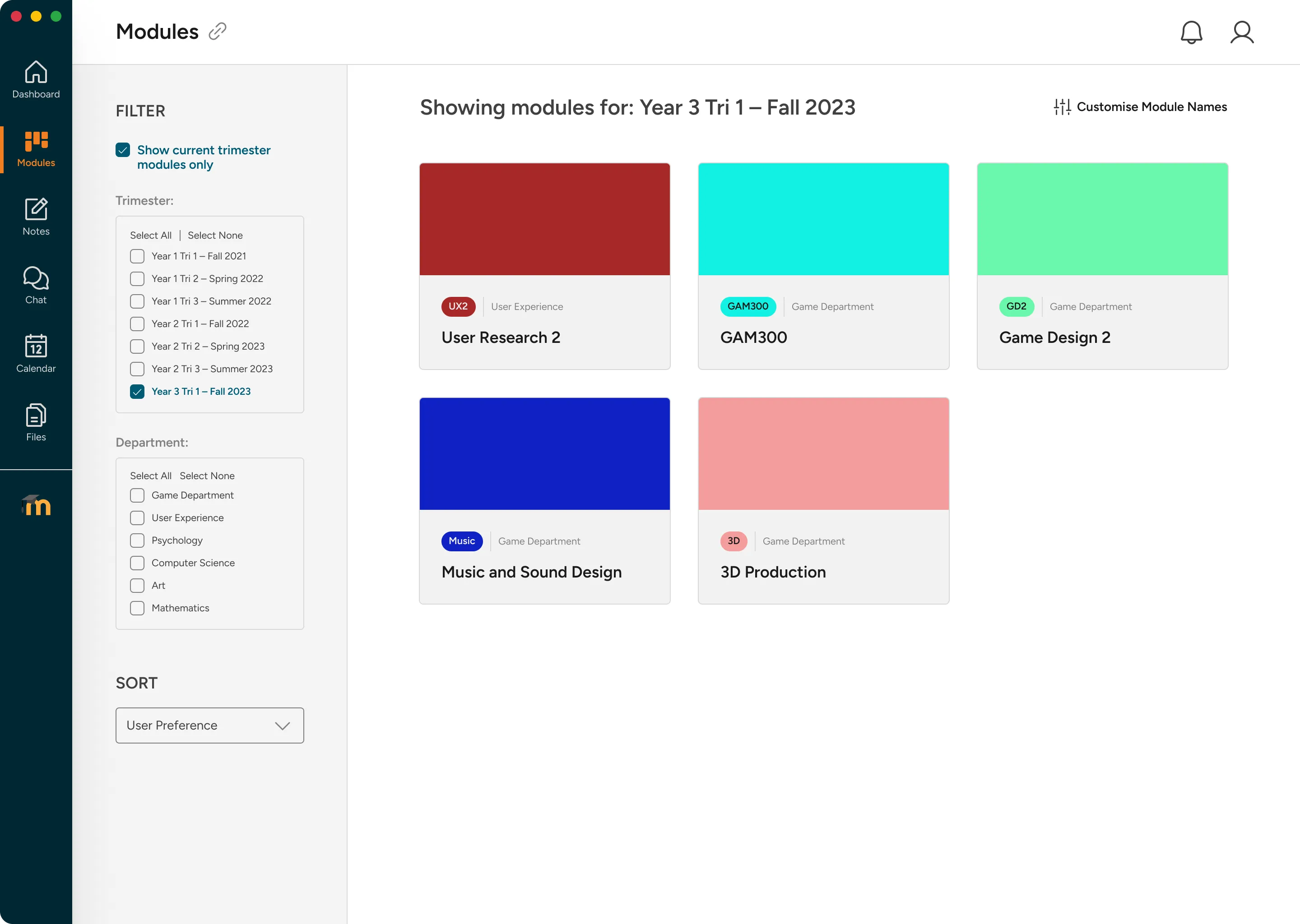
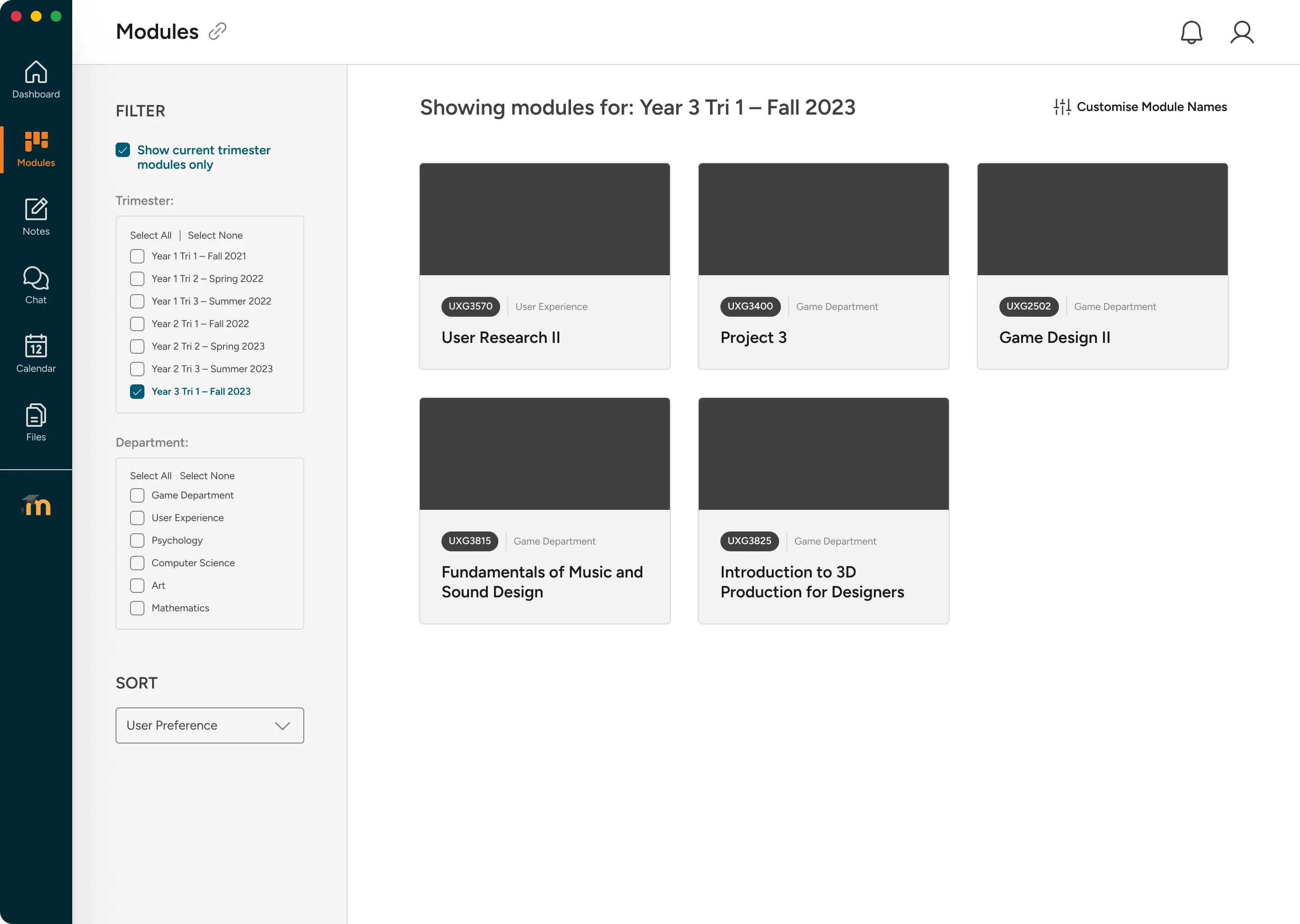
Modules you can actually tell apart
Colour-coded, renameable cards let students replace cryptic codes like 'UXG3570' with names they actually understand.
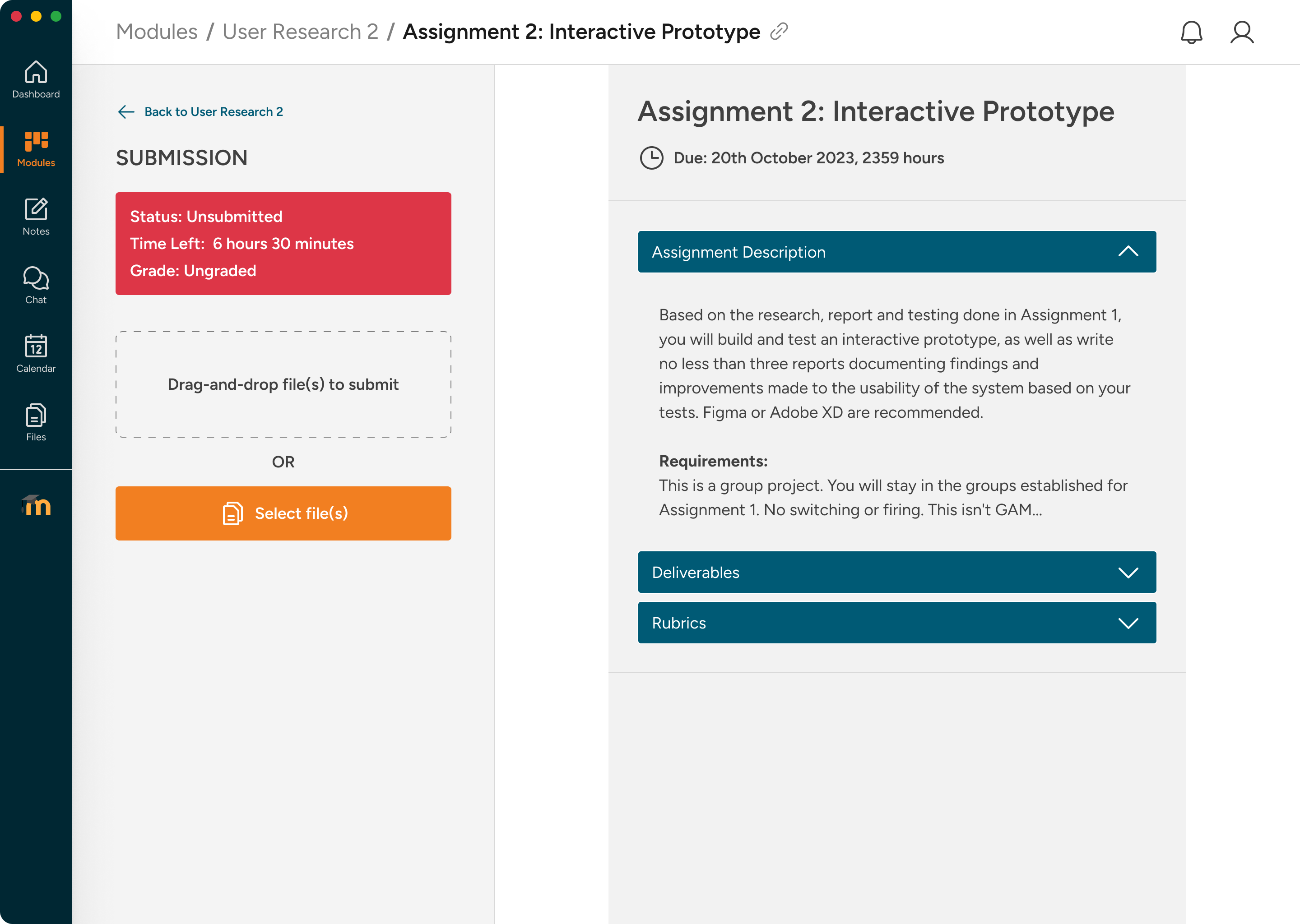
Submit in two clicks
A split layout pins the upload panel to the left. Drag-and-drop replaces the five-step original flow.
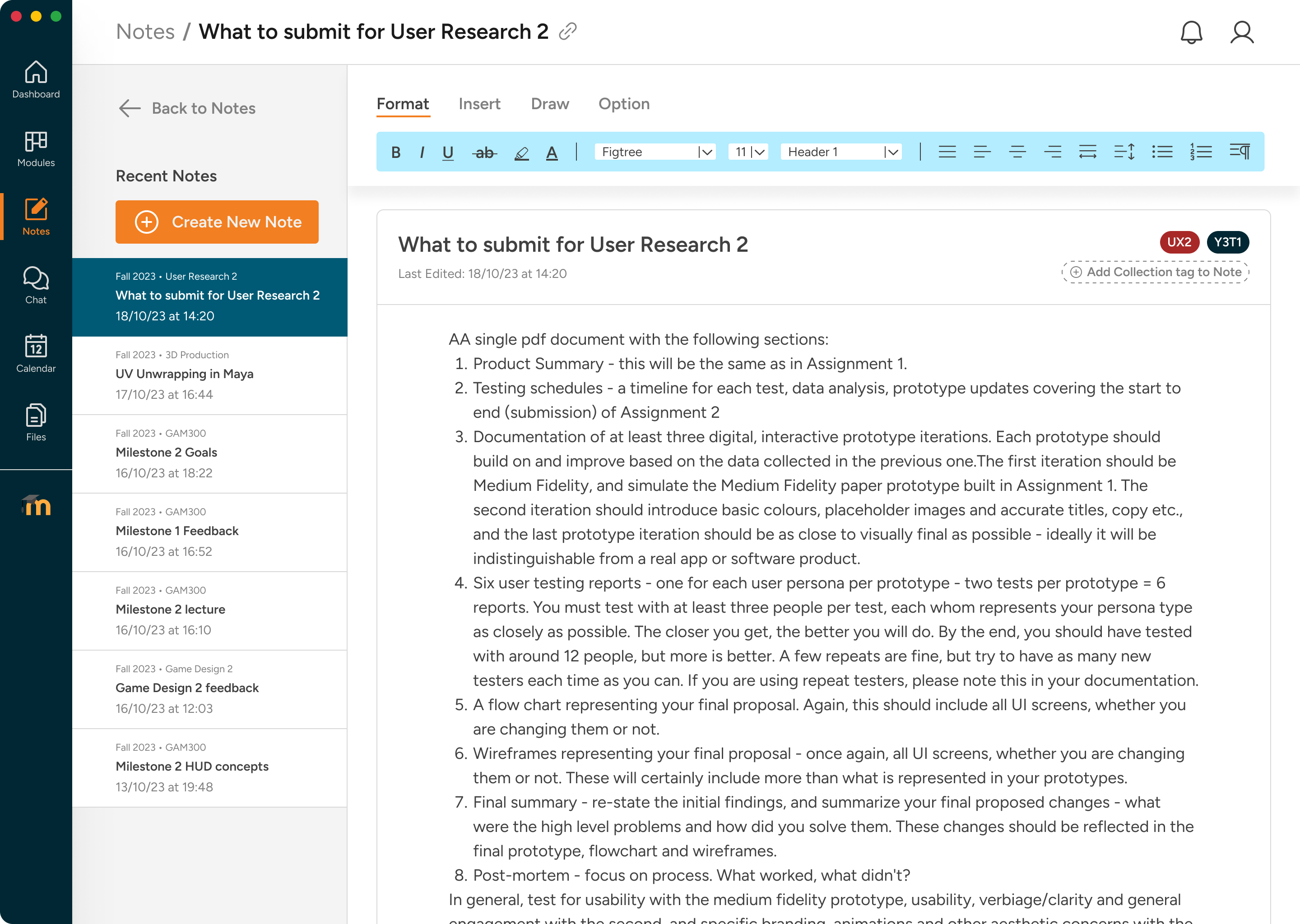
Notes built into Moodle
An integrated note-taking space with module tagging, drawing tools, and formatting — no third-party app needed.
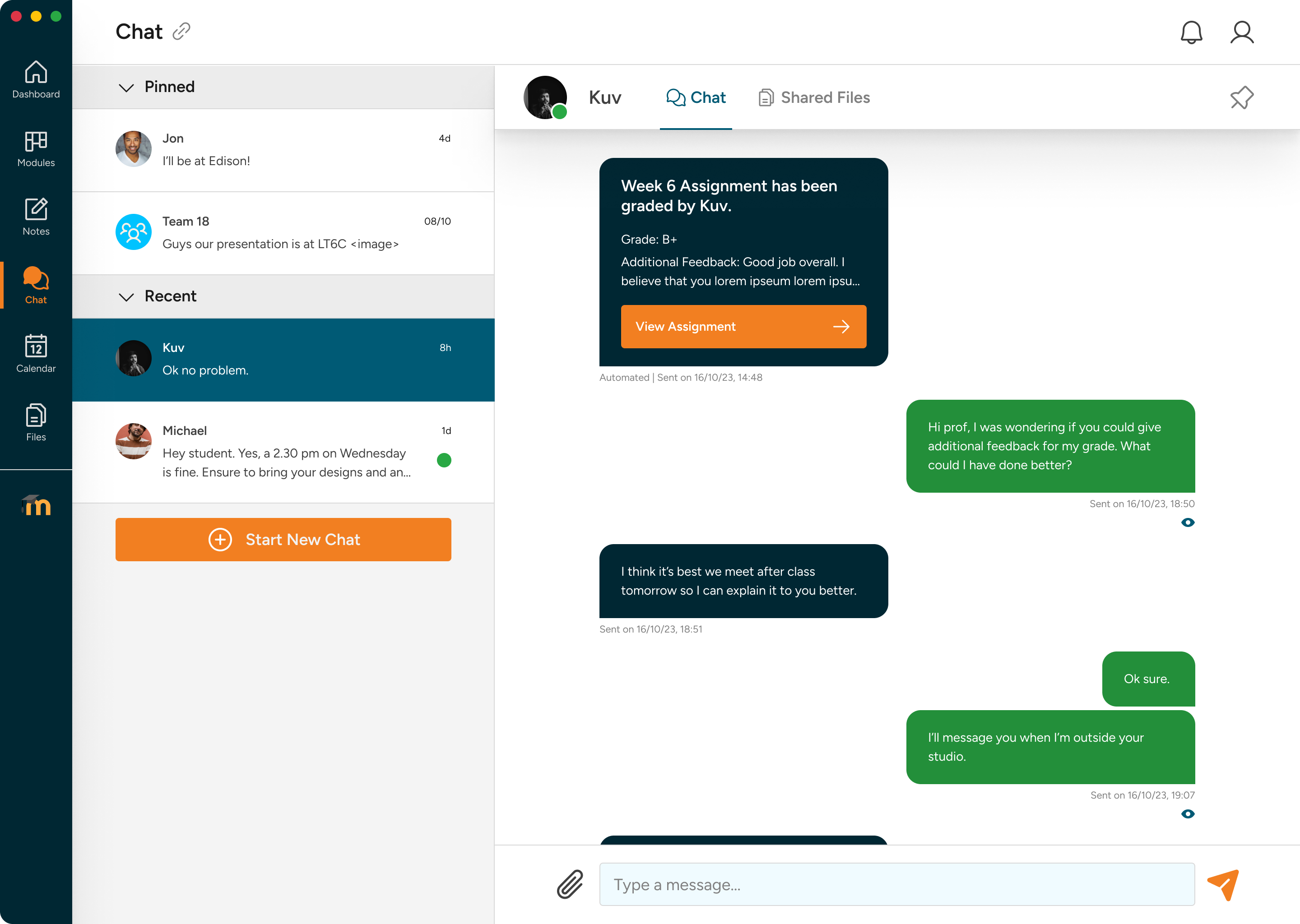
Chat without leaving Moodle
In-app messaging with pinned conversations and automated grade announcements replaces the reliance on MS Teams.
Have at least 11 minutes? Read the case study below.
Moodle at DigiPen worked. Students just hated using it.
Alleviating academic friction. Moodle is DigiPen’s core desktop LMS. While functionally robust, the system created daily friction for students: cryptic module codes, a cluttered dashboard, disconnected study tools, and a five-click assignment submission flow. This 8-week sprint focused on rebuilding the student experience first, with professor workflows treated as supporting scope.
Try the Prototypes
Explore the redesigned Moodle experience through the original Figma prototypes, or try the student-only Astro prototype as a working browser experience.
- Try the student Figma prototype →
- Try the professor Figma user flow →
- Try the student-only interactive Astro prototype →
The Astro prototype was built after the Figma case study to make the student flow testable in-browser. I used Figma MCP to pull screen-level design context, Claude Sonnet 4.5 to generate the Astro routes, components, CSS, and vanilla JavaScript interactions, then refined the result against build-prompt.md, style-guide.md, and the original Figma frames.
Context & Problem
Accumulated daily friction. The LMS technically managed grades and course files, but student workflows created a high cognitive load around navigation, submission, note-taking, file storage, and course communication.
The problem
An interface that technically worked but frustrated students using it every day.
The pain wasn't one big issue — it was accumulated friction across recurring student tasks.
Cluttered dashboard
Five overlapping sections — Recently Accessed Courses, Course Overview, My Courses, Timeline, and Private Files — all visible above the fold, many serving the same purpose.
Indistinguishable module codes
Courses were named with institutional codes like 'UXG3570' with no colour coding or renaming. Students memorised new cryptic strings every trimester.
Five-click assignment submission
Navigate from dashboard → module page → scroll to find submission section → click Add Submission (page reload) → upload → save. A minimum of five distinct interactions for a daily task.
Disconnected study tools
Notes, chat, file storage, and deadline tracking all happened outside Moodle, forcing students to stitch together their own learning system.
Core Strategic Constraints:
- Zero backend alterations: Maintain compatibility with Moodle’s native database structure and administrative options.
- Short 8-week delivery: Deliver fully validated high-fidelity prototypes and design assets within two months.
- Supporting professor scope: Keep professor grading and course-management flows compatible with the redesigned student experience.
The Process: Behind the Scenes
Grounded in user empathy. We surveyed 20+ respondents and conducted qualitative interviews to understand how students actually navigated Moodle during a trimester.
- Dylan Tay (Primary Student Persona): Dylan struggled to locate files, memorise course codes, and track deadlines. He relied on external note-taking tools and was routinely logged out mid-session.
- Irene Ong (Supporting Professor Persona): Irene helped us test the downstream professor workflows that students depend on: uploads, announcements, and grading.
Iterative Digital Wireframing. We mapped the core informational hierarchies first, focusing on collapsing Moodle’s crowded blocks into focused modules before exploring visual assets.
Deep Dive: Key Design Decisions (Student)
Focused Dashboard: Consolidating five sections into three panels
Reducing cognitive load. The student dashboard organises information into three prominent regions: upcoming deadlines, colour-coded module cards, and a trimester completion donut. A sticky navigation dock provides instant, one-click access across all tabs.
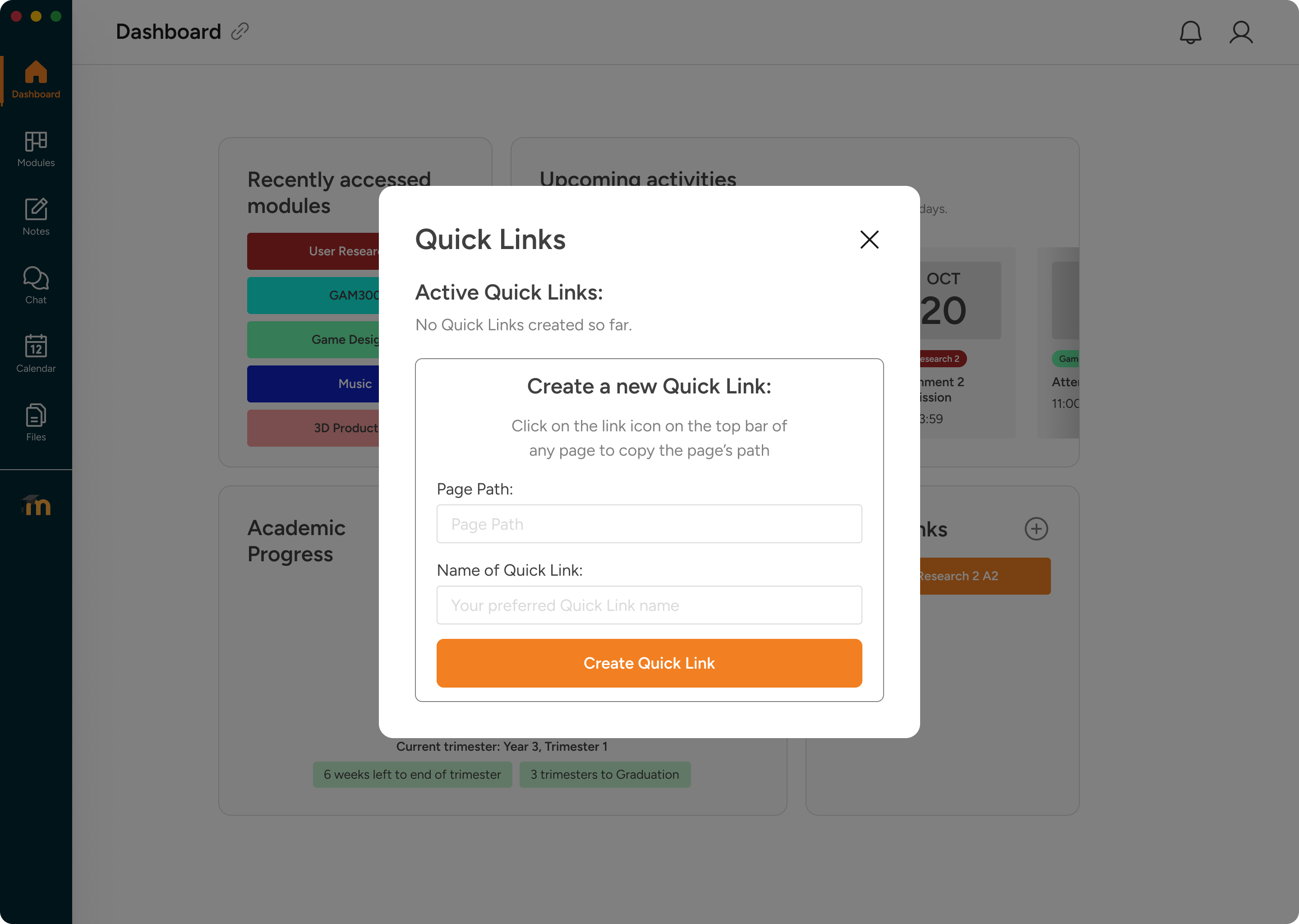
Personalized quick links. Tapping into research about navigation friction, we introduced a Quick Links creator. This allows students to pin frequently visited course directories or specific grading threads directly to their home dashboard.
Module Navigation: Eliminating Cryptic Codes via Renameable Cards
Making modules identifiable. Students can filter cards by department or trimester, and customise module labels. Replacing standard strings like “UXG3570” with names like “User Research II” resolved the most common usability complaint.
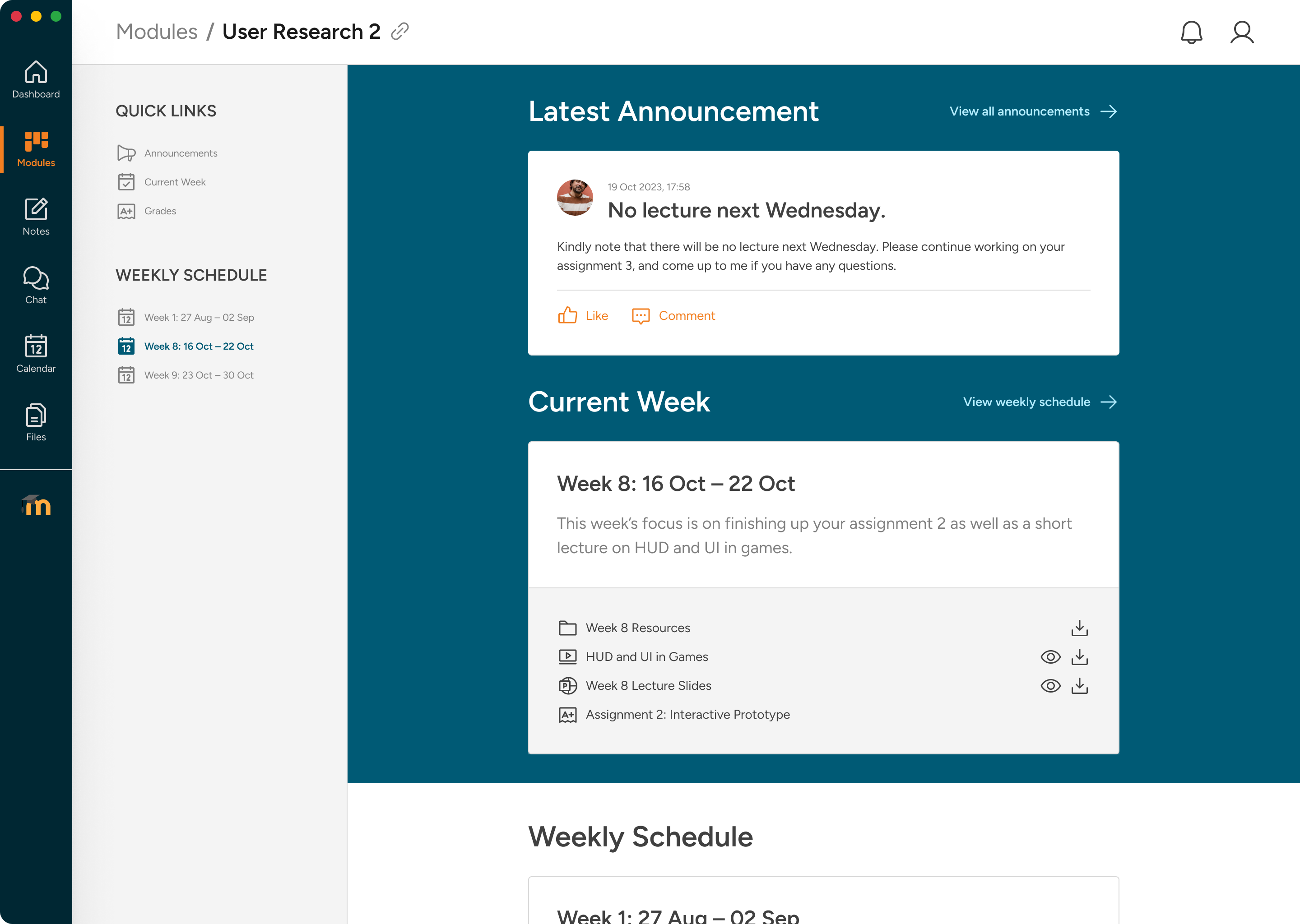
Organised course content. Within individual courses, the active week is automatically pinned to the top. Course resources open directly in a preview modal, preventing accidental, silent downloads.
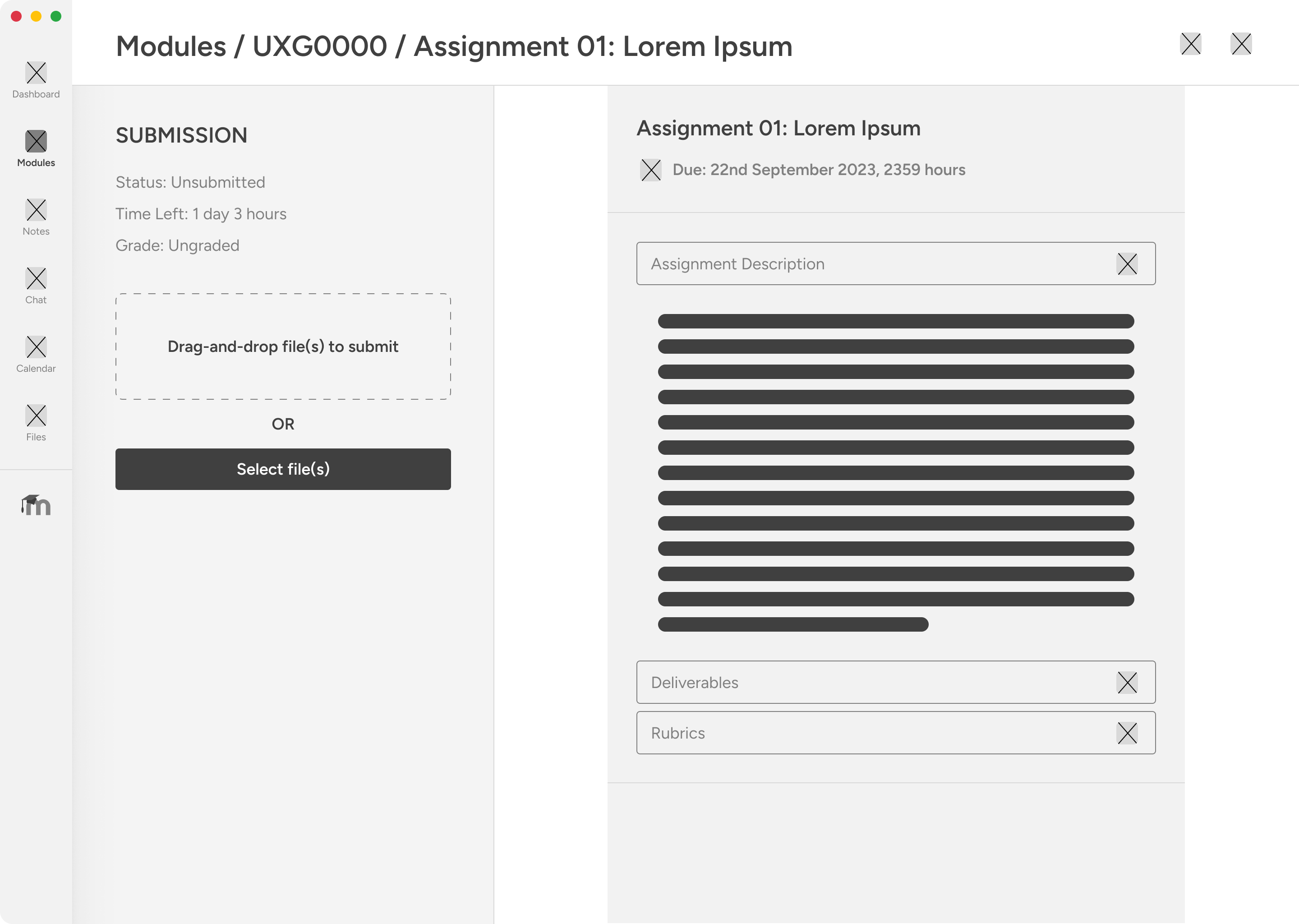
Split Submission Layout: Drag-and-Drop and Sticky Briefs
Simplifying assignment flows. The new submission page uses a two-panel split screen. The briefing accordion sits on the left, while a sticky upload panel stays visible on the right, reducing a click-heavy process to a drag, drop, and confirm sequence.
Submission flow
From five steps to two
01
Navigate to the right module
Colour coding and renaming make finding the right module instant — no more memorising code strings.
02
Open the assignment
Submissions surface prominently in the weekly content — no scrolling through walls of text to find the link.
03
Drag, drop, done
The sticky upload panel accepts drag-and-drop or files from the Files stash. Upload status is clearly shown.

Integrated Utilities: Replacing Third-Party Tools in Context
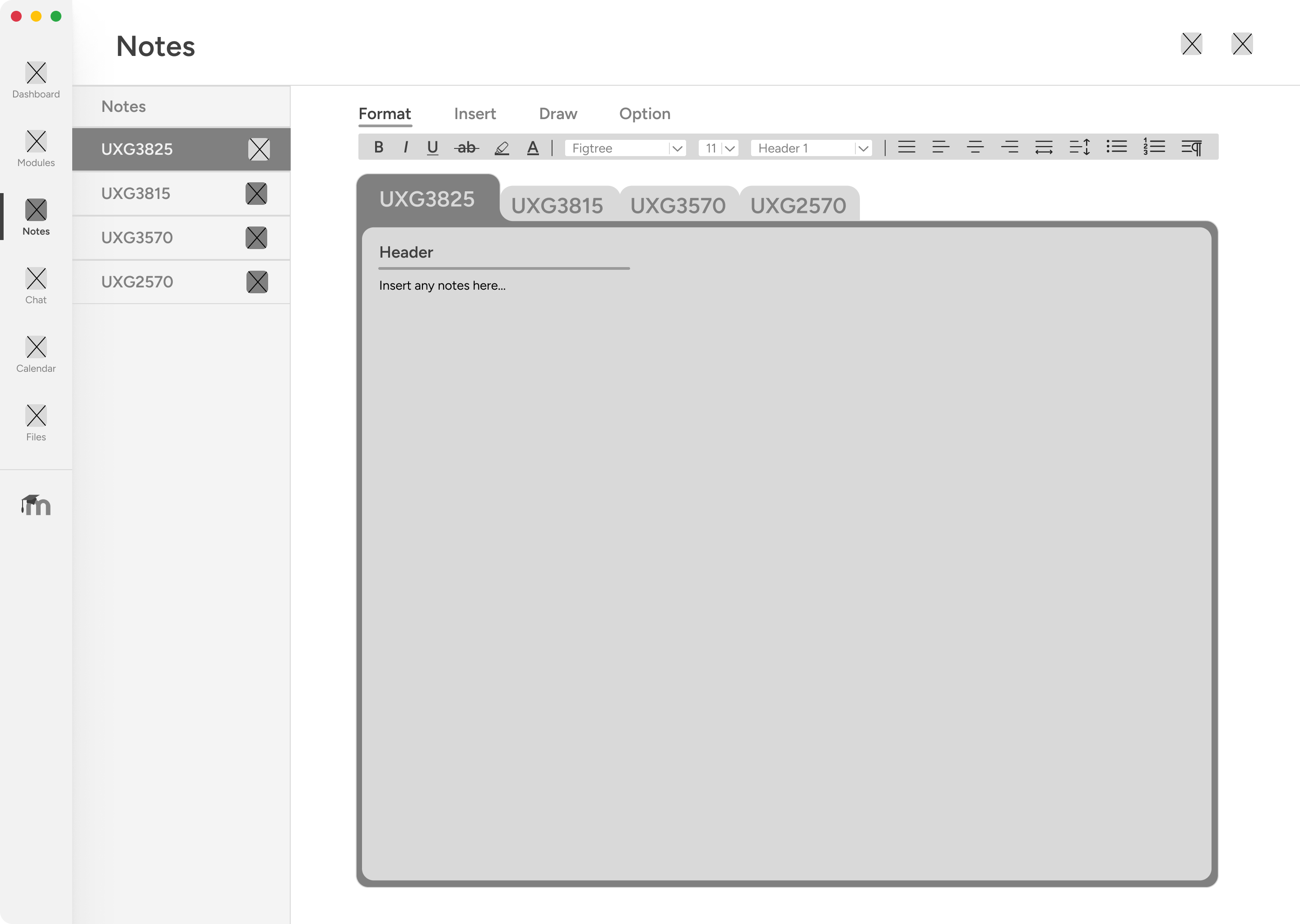
Taking notes inside the LMS. The native Notes page features formatting controls, a drawing canvas, and trimester tagging, keeping lecture notes linked directly to modules.
Centralised asset storage. The Files stash acts as a local drive. Students can upload resources, organise folders, and instantly attach stored files to active submissions.
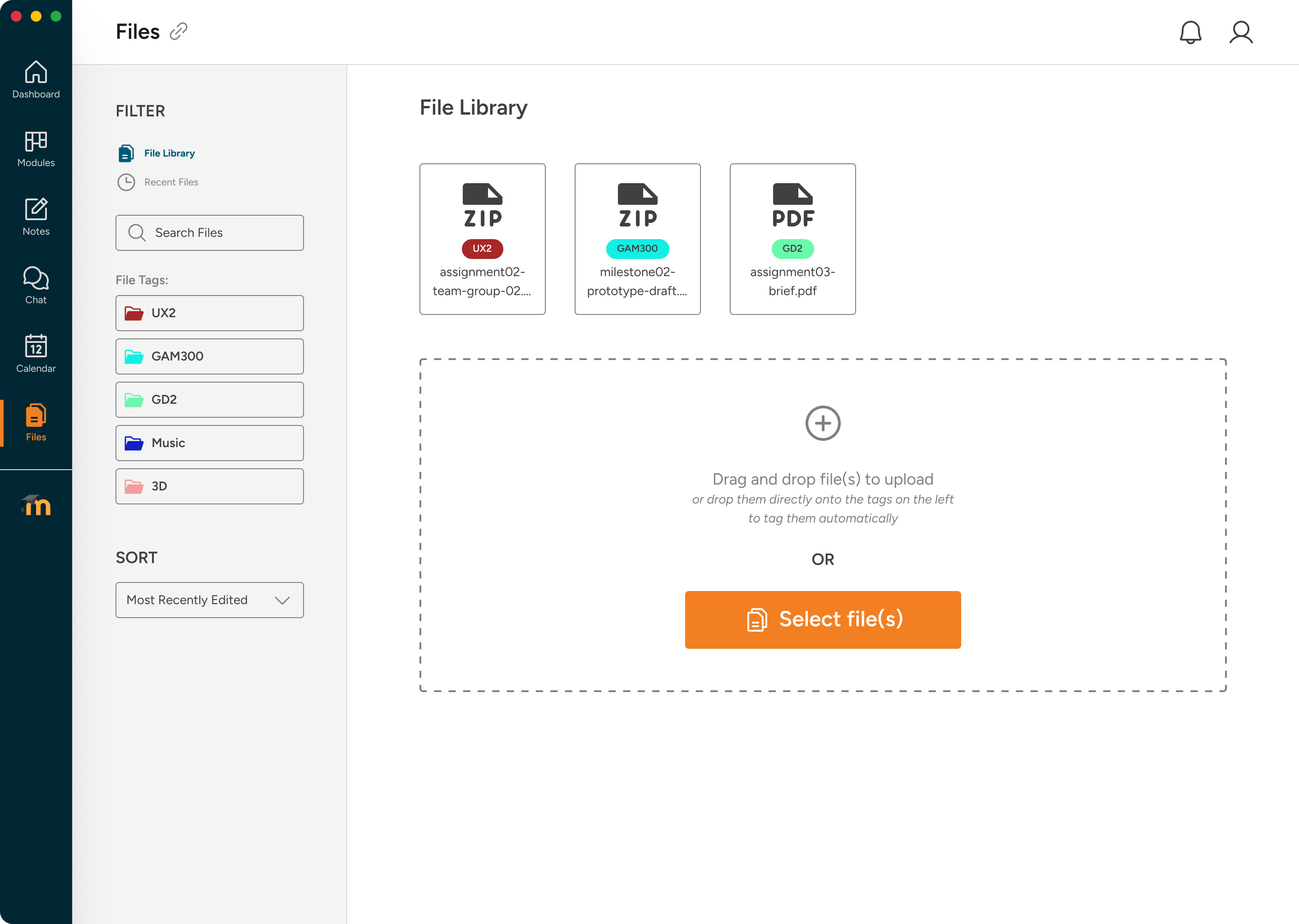
Course communication. The Chat system replaces Microsoft Teams. It features pinned group channels, direct messaging, and automatic grade notifications.
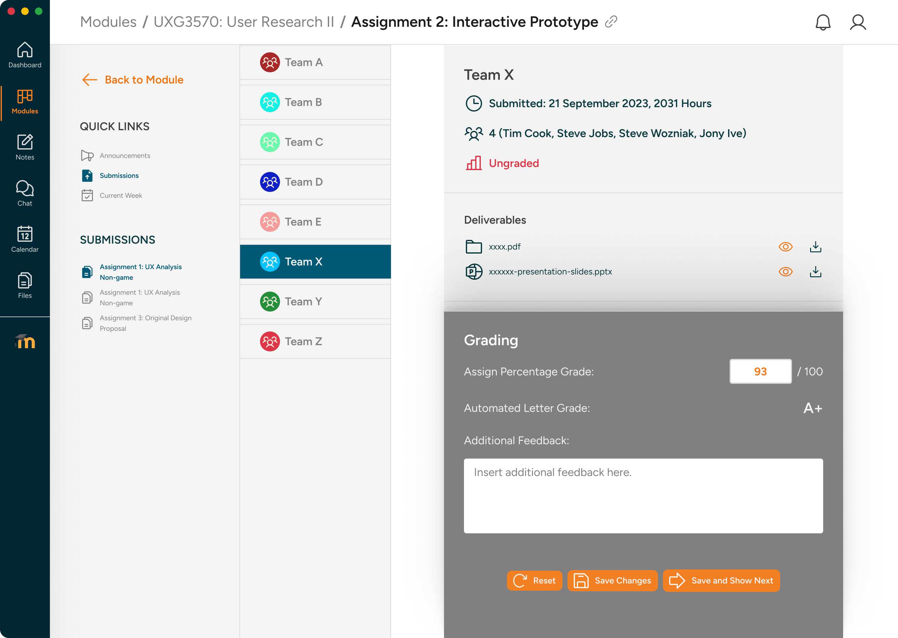
Supporting Scope: Professor Workflows
The redesign also included a smaller professor flow so student-facing improvements had a credible administrative counterpart. We focused on the three workflows that most directly affected students: uploading weekly content, publishing announcements, and grading submissions.
Impact & Outcomes
Tested across three rounds. We ran three iterative prototype rounds with real DigiPen users. By incorporating targeted improvements, we resolved all usability complaints in the final high-fidelity test round.
Project snapshot
The redesign in numbers
3
prototype iterations tested
Each version was tested with real users, and every design decision in V2 and V3 was directly traceable to feedback from the previous round.
2
user groups considered
Students were the primary case study focus, while professors were treated as supporting scope for upload, announcement, and grading workflows.
5→2
clicks to submit an assignment
The original flow required five steps including a page reload. The redesign pinned the upload panel and reduced submission to drag, drop, and confirm.
3
third-party tools replaced
Notes replaced external note-taking apps, Chat replaced Microsoft Teams, and Files replaced ad-hoc document sharing — all integrated into Moodle.
Before and after — student experience
The issues were structural, not cosmetic. Each change addressed a specific student failure mode in the original platform.
Student dashboard
Five overlapping sections above the fold — Recently Accessed, Course Overview, My Courses, Timeline, Private Files — all serving similar purposes. Upcoming Events buried below the fold.
Three focused sections: upcoming activities strip, academic progress chart, and quick links. Colour-coded module cards with renaming. All above the fold.
Assignment submission
Five clicks: dashboard → module page → scroll → Add Submission (page reload) → upload → save. No upload feedback. Videos silently downloaded instead of previewing.
Two interactions: open assignment, drag and drop. Sticky upload panel stays visible. Clear submitted confirmation. Files open in preview modal.
Communication and storage
No in-app messaging — course communication lived in Microsoft Teams. No centralised file storage. No in-app note-taking.
Chat with pinned conversations and automated grade notifications. Files with module tagging and drag-and-drop upload. Notes with formatting, draw, and collection organisation.
Outcome
Zero negative findings in the final round. Three student workarounds replaced.
Three prototype versions, six testing sessions with real DigiPen users, and a final design that made the student experience clearer, faster, and more integrated.
0
Negative findings in V3 testing.
The final testing round surfaced no negative feedback — only minor polish suggestions, all incorporated.
3
Third-party tools replaced by integrated features.
Notes replaced external note-taking apps, Chat replaced Microsoft Teams for course communication, and Files replaced ad-hoc document sharing.
~60%
Fewer clicks for key student tasks.
Assignment submission went from five clicks to two, while key content, files, notes, and communication flows were brought into one interface.
100%
Of professors preferred the supporting grading interface.
Every professor tested found the team-based view with individual override and quick grade more convenient than what they had been using.
Reflection
Value of iterative cohort testing. Engaging the same cohort across three testing rounds was highly effective. Moving from general usability concerns in V1 to specific, detailed improvement requests in V2 and V3 drastically accelerated our design refinement quality.
Usability friction vs. missing features. Students didn’t explicitly request an in-app “Notes” or “Chat” module; they complained that course content felt completely disconnected from their study groups. Addressing structural integration gaps was much more valuable than implementing requested cosmetic patches.
Contents